Customization Guide
This notebook demonstrates how to customize Qt-Material themes, including color schemes, font styles, and advanced stylesheet modifications.
Theme Customization
To create a custom theme, edit the color values directly in an XML file with the following format:
[ ]:
<!--?xml version="1.0" encoding="UTF-8"?-->
<resources>
<color name="primaryColor">#00e5ff</color>
<color name="primaryLightColor">#6effff</color>
<color name="secondaryColor">#f5f5f5</color>
<color name="secondaryLightColor">#ffffff</color>
<color name="secondaryDarkColor">#e6e6e6</color>
<color name="primaryTextColor">#000000</color>
<color name="secondaryTextColor">#000000</color>
</resources>
Save it as my_theme.xml or similar and apply the style sheet from Python.
[ ]:
apply_stylesheet(app, theme='dark_teal.xml')
Custom QPushButton Styles and Fonts
You can customize the appearance of QPushButton widgets by using the extra argument when applying the stylesheet. This allows you to define custom colors and fonts.
[ ]:
extra = {
    # Button colors
    'danger': '#dc3545',
    'warning': '#ffc107',
    'success': '#17a2b8',

    # Font
    'font_family': 'Roboto',
}

apply_stylesheet(app, 'light_cyan.xml', invert_secondary=True, extra=extra)
To apply a specific style to a button, use the setProperty() method with the appropriate class name:
[ ]:
pushButton_danger.setProperty('class', 'danger')
pushButton_warning.setProperty('class', 'warning')
pushButton_success.setProperty('class', 'success')
This will apply the color defined for each class in the stylesheet.
Custom stylesheets
You can override or extend the default Qt-Material styles using an external .css file.
Example custom.css content:
[ ]:
QPushButton {{
  color: {QTMATERIAL_SECONDARYCOLOR};
  text-transform: none;
  background-color: {QTMATERIAL_PRIMARYCOLOR};
}}

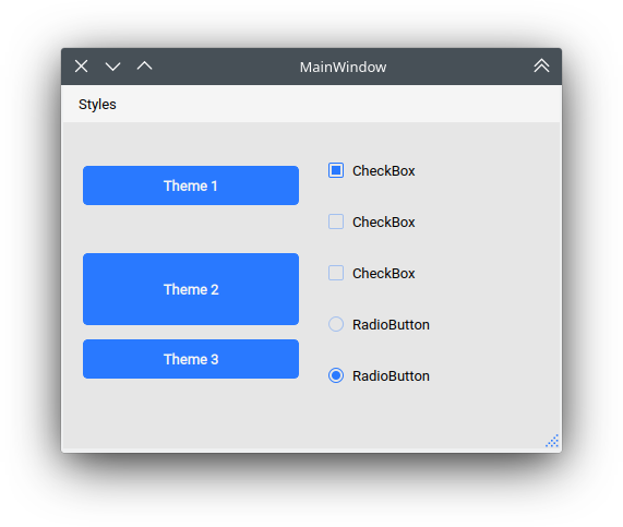
.big_button {{
  height: 64px;
}}
Apply the stylesheet:
[ ]:
apply_stylesheet(app, theme='light_blue.xml', css_file='custom.css')
Runtime update:
You can also apply a custom stylesheet dynamically at runtime:
[ ]:
stylesheet = app.styleSheet()
with open('custom.css') as file:
    app.setStyleSheet(stylesheet + file.read().format(**os.environ))
To apply a class-based style:
[ ]:
self.main.pushButton.setProperty('class', 'big_button')
This allows you to modularly apply different layout or visual rules without modifying the core theme.
Remove theme from single widget
In some cases, you might want to exclude a specific widget from the global theme. You can reset the style for that widget using:
widget.setStyleSheet('')
This removes all inherited styling, making the widget fallback to the system or Qt default appearance. Useful for custom painting or embedded platform-native controls.
Density scale
The extra argument also includes an option to control the density scale, which affects the spacing and sizing of UI elements. By default, the scale is set to 0.
You can reduce or increase density using negative or positive values:
[ ]:
extra = {
    'density_scale': '-2',  # Lower density (more compact layout)
}

apply_stylesheet(app, 'default', invert_secondary=False, extra=extra)
This setting is helpful for adapting your UI to different screen sizes or accessibility preferences.

