Qt-Material


Qt-Material is a modern stylesheet library for PySide6 and PyQt6, inspired by Material Design.
It provides: - Dark and light themes - Custom accent colors and fonts -
Runtime theme switching - Export to .qss + .rcc for use in C++
or standalone apps - Density scaling for accessibility
Theme Previews
Qt-Material includes a variety of built-in themes, both in dark and light modes.
Dark themes:
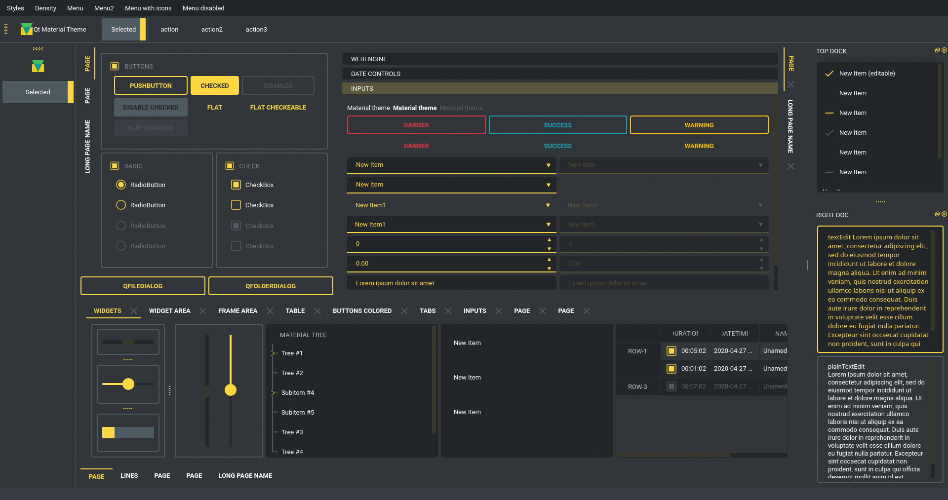
dark
Light themes:
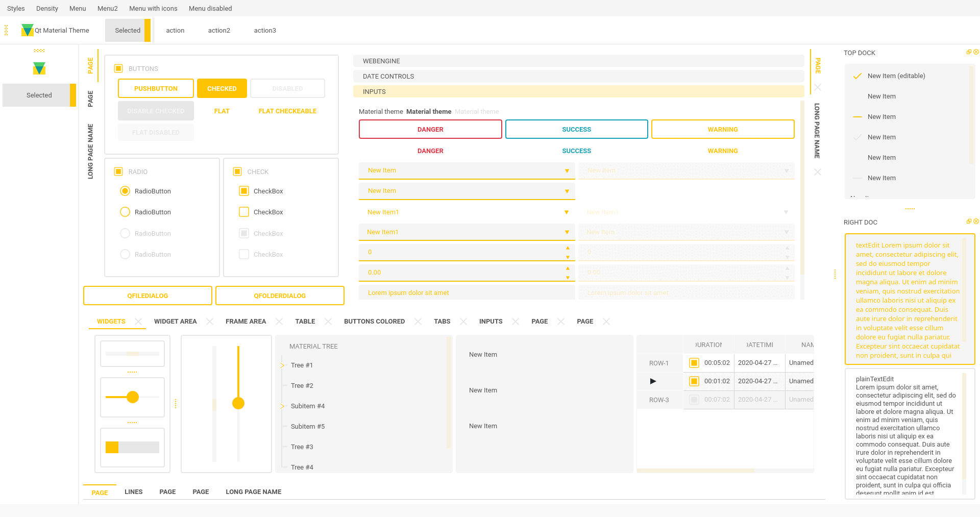
light
Installation
pip install -U qt-material
Or from source:
git clone https://github.com/dunderlab/qt-material.git
cd qt-material
pip install .
Documentation
Comprehensive usage guides, examples, and API reference are available online:
Basic Usage
To apply a Material Design-inspired stylesheet to your Qt application,
simply use apply_stylesheet() from the qt_material module.
Example using PySide6
import sys
from PySide6 import QtWidgets
from qt_material import apply_stylesheet

# Create application instance and main window
app = QtWidgets.QApplication(sys.argv)
window = QtWidgets.QMainWindow()

# Apply a built-in theme
apply_stylesheet(app, theme='dark_teal.xml')

# Show the window and execute
window.show()
app.exec()
Optional: Using PyQt5 or PyQt6
Just replace the import line:
from PyQt5 import QtWidgets
# or
from PyQt6 import QtWidgets
Themes
To view all available built-in themes, use the list_themes()
function:
from qt_material import list_themes

print(list_themes())
Example output:
['dark_amber.xml',
 'dark_blue.xml',
 'dark_cyan.xml',
 'dark_lightgreen.xml',
 'dark_pink.xml',
 'dark_purple.xml',
 'dark_red.xml',
 'dark_teal.xml',
 'dark_yellow.xml',
 'light_amber.xml',
 'light_blue.xml',
 'light_cyan.xml',
 'light_cyan_500.xml',
 'light_lightgreen.xml',
 'light_pink.xml',
 'light_purple.xml',
 'light_red.xml',
 'light_teal.xml',
 'light_yellow.xml']
To apply any of these themes, pass the filename to
apply_stylesheet():
apply_stylesheet(app, theme='light_purple.xml')
Light themes
When using a light theme, it’s recommended to enable
invert_secondary=True to ensure text and contrast are properly
rendered for bright backgrounds.
from qt_material import apply_stylesheet

apply_stylesheet(app, theme='light_red.xml', invert_secondary=True)
This helps maintain proper visibility and icon behavior in light mode.
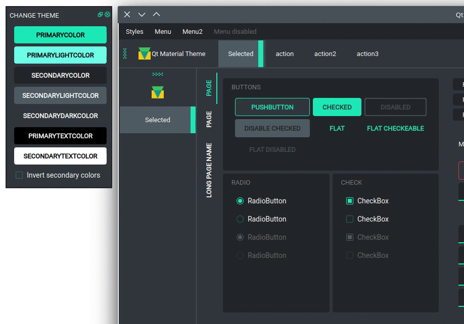
Environment Variables
The following environment variables are related to the current theme used. These variables are for consultation purposes only.
Environment Variable |
Description |
Example |
|---|---|---|
QTMATERIAL_PRIMARYCOLOR |
Primary color |
#2979ff |
QTMA TERIAL_PRIMARYLIGHTCOLOR |
A bright version of the primary color |
#75a7ff |
Q TMATERIAL_SECONDARYCOLOR |
Secondary color |
#f5f5f5 |
QTMATE RIAL_SECONDARYLIGHTCOLOR |
A bright version of the secondary color |
#ffffff |
QTMAT ERIAL_SECONDARYDARKCOLOR |
A dark version of the secondary color |
#e6e6e6 |
QTM ATERIAL_PRIMARYTEXTCOLOR |
Color for text over primary background |
#000000 |
QTMAT ERIAL_SECONDARYTEXTCOLOR |
Color for text over secondary background |
#000000 |
QTMATERIAL_THEME |
Name of theme used |
light _blue.xml |
Run examples
A window with almost all widgets (see the previous screenshots) is available to test all themes and create new ones.
git clone https://github.com/UN-GCPDS/qt-material.git
cd qt-material
python setup.py install
cd examples/full_features
python main.py --pyside6
This will launch a live preview application where you can:
Browse all available themes
Switch stylesheets at runtime
Customize fonts and colors
Export your personalized theme
theme